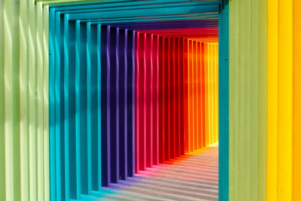
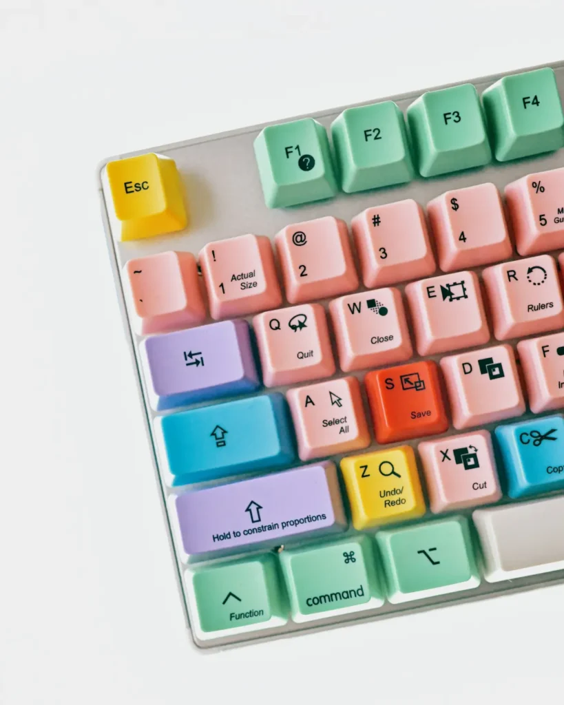
Color is one of the most powerful elements in visual communication—and for web designers, it’s more than just aesthetics. From evoking emotion to shaping perception and behavior, the colors you choose can make or break your website’s success.
In this in-depth guide, we’ll explore the fundamentals of color psychology, analyze how different colors impact users, and provide actionable tips for choosing the right color palette for your next web project.
First Impressions Matter: The Role of Color in Design
What’s your first thought when you see Coca-Cola’s bold red branding? Or why do most hospital websites use white and blue?
These aren’t coincidences—they’re strategic color choices.
In multimedia and web design, visual appearance is everything. And color sits at the core of that appearance. It doesn’t just “decorate” the design. It directs attention, sets the mood, and influences decision-making.
Color can:
- Evoke emotion
- Build brand identity
- Improve readability
- Guide user navigation
- Impact conversions
In fact, studies show that 85% of consumers make buying decisions based on color, and 92% believe visual appearance is the most persuasive marketing factor.
What Is Color Psychology?
Color psychology is the study of how colors affect human behavior, mood, and perception. It’s widely used in branding, design, marketing, and even healthcare.
Each color carries symbolic meanings and psychological triggers. When used thoughtfully, these triggers can:
- Reinforce your brand message
- Create a mood or tone for the user experience
- Influence user interaction and conversion rates
But color isn’t universal. Meaning can shift based on culture, context, and personal experience—so what works in one region may not translate the same way in another.
Why Color Choice Matters in Web Design
When choosing a color palette for a website, your goal isn’t just to make something that “looks good.” It’s to create a site that:
- Reflects the brand’s personality
- Connects with the audience emotionally
- Leads users toward a goal (buy, sign up, etc.)
- Is readable and accessible on all devices
Color is strategic, not decorative.
Done right, it builds trust and clarity. Done wrong, it confuses or alienates visitors.
Understanding Color Meanings and Associations
Let’s explore the meanings of commonly used colors in design, including both positive and negative associations. These insights are key to making intentional color choices.
Red

Positive: Passion, energy, strength, excitement, urgency
Negative: Aggression, warning, restlessness
Example: Coca-Cola, Nike, YouTube — use red to stimulate attention and action
Blue
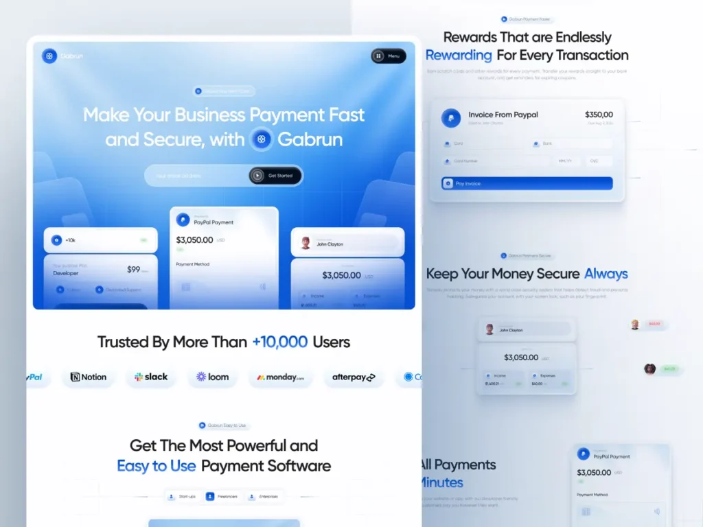
Positive: Trust, stability, calmness, professionalism
Negative: Coldness, melancholy, emotional distance
Example: Facebook, PayPal, LinkedIn — convey security and reliability
Yellow
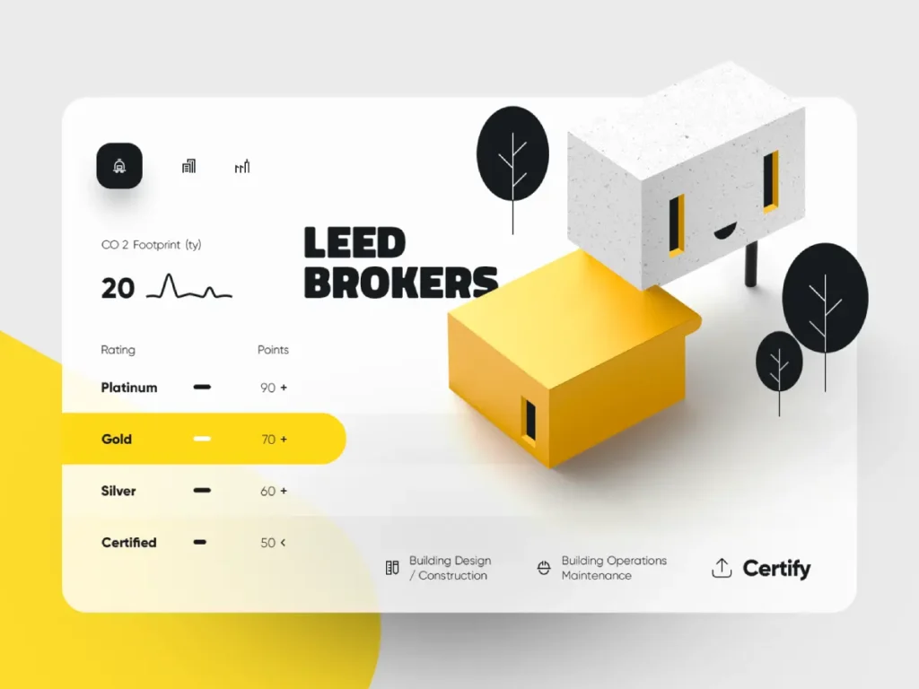
Positive: Optimism, creativity, friendliness, warmth
Negative: Anxiety, frustration (when overused)
Example: McDonald’s, Nikon — cheerful and attention-grabbing
Green
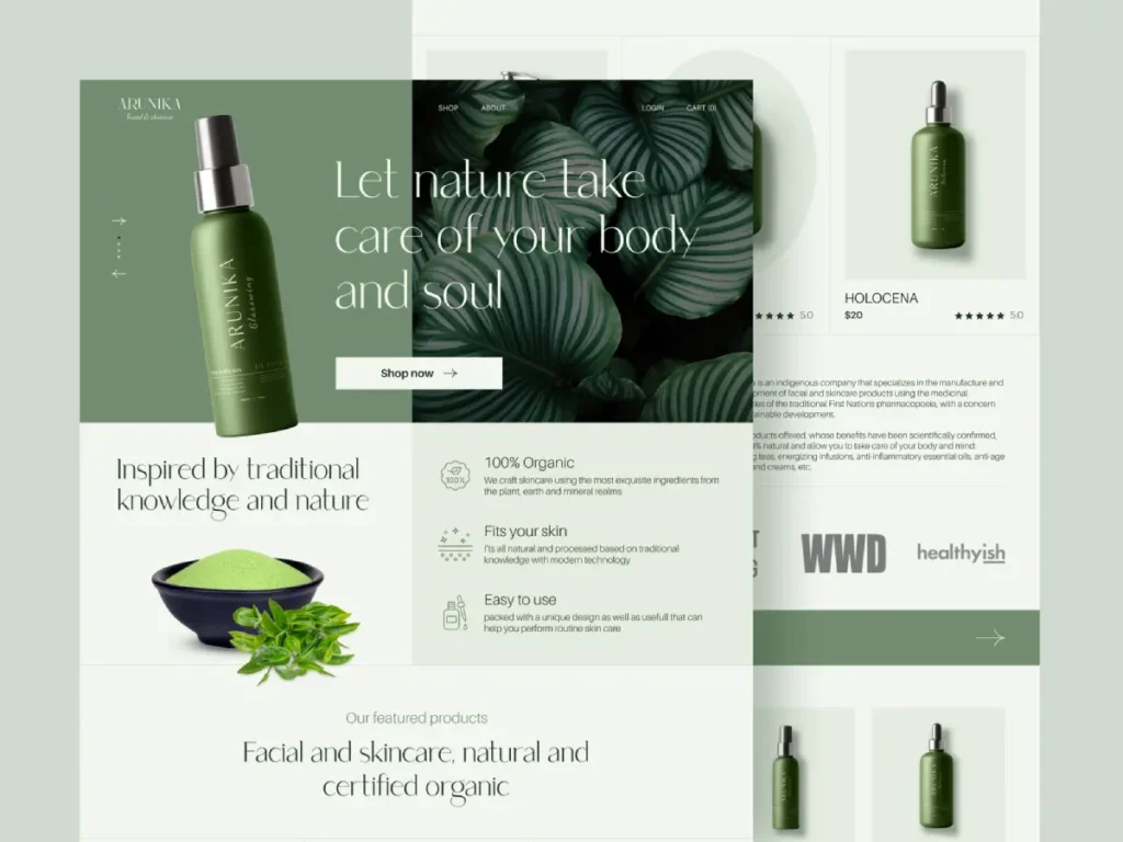
Positive: Nature, growth, health, balance, eco-friendliness
Negative: Stagnation, envy
Example: Spotify, Whole Foods, WhatsApp — promote harmony and well-being
White
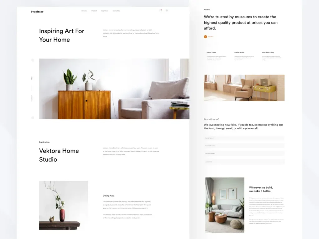
Positive: Simplicity, cleanliness, purity, minimalism
Negative: Sterility, emptiness, boredom
Example: Apple, healthcare sites — give a clean and professional feel
Black
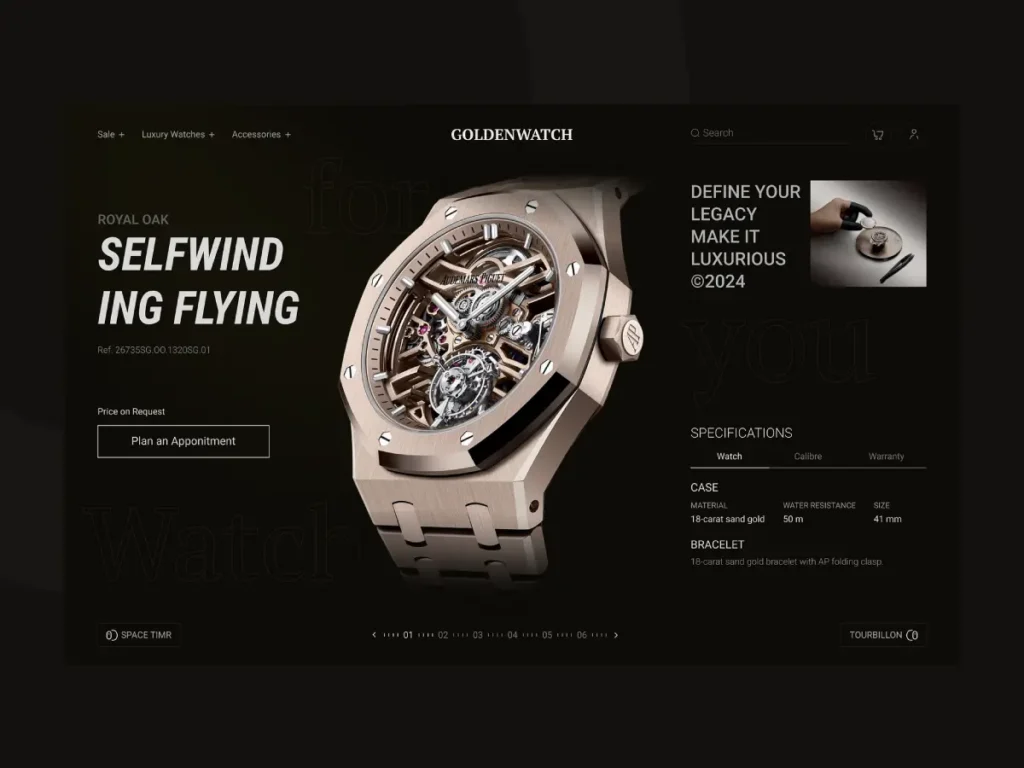
Positive: Luxury, power, elegance, mystery
Negative: Depression, heaviness, formality
Example: Chanel, Nike, Tesla — used in high-end, premium branding
Keep in mind: cultural context matters. For example, black signifies mourning in Western cultures, but white plays that role in some Asian traditions.
5 Practical Tips for Choosing the Right Website Color Scheme
Now that you understand how colors work psychologically, let’s explore how to use that knowledge in your web design process.
1. Understand the Purpose and Audience of the Website
Different demographics respond differently to colors:
- Children: Bright, energetic colors (yellow, red, blue)
- Women: Soft, pastel tones (lavender, pink, teal)
- Men: Strong, bold colors (blue, black, red)
- Older audiences: Softer contrast, clear readability
Also, consider whether the site is meant to inform, entertain, sell, or inspire—each goal may require a different mood and palette.
2. Consider Cultural Context and Regional Preferences
Colors hold different meanings across cultures. Here are a few examples:
- White: Purity in the West, mourning in some Asian countries
- Yellow: Royalty in Egypt, jealousy in France
If your audience is global, do thorough research or A/B testing across regions.
3. Choose a Primary Brand Color and Stick to It
Pick one main color that communicates the core identity of your brand, then build around it.
Use tools like:
These tools help you generate balanced and accessible color palettes based on color theory and harmony.
4. Keep Up with Current Color Trends (But Don’t Rely on Them)
Design trends change. What’s popular today may feel outdated next year.
Recent trends include:
- Pastel gradients
- Earth tones and muted colors
- Dark mode and deep contrast palettes
While it’s good to stay modern, don’t choose trendy colors if they don’t align with your brand values or user goals.
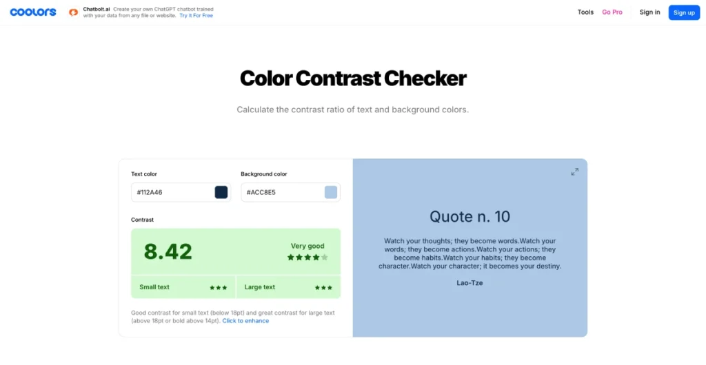
5. Ensure Contrast, Accessibility & Cross-Device Compatibility
Great color schemes don’t just look good—they work well for everyone.
Use these tips for accessibility:
- Check contrast with WebAIM Color Contrast Checker
- Use color combinations that are color-blind-friendly
- Avoid relying solely on color to communicate meaning (e.g., don’t use red text to mean “error” without adding a symbol)
Also, preview your color choices on:
- Mobile phones (in different lighting)
- Desktop monitors
- Tablets
- Light and dark mode settings
Bonus Tip: Test and Iterate
After choosing your color palette, test it in real-world scenarios:
- Show mockups to real users or clients
- Run A/B tests on CTAs or banner colors
- Measure bounce rates and conversion rates
Color testing is often overlooked, but it can dramatically impact performance.
Final Thoughts: Why Thoughtful Color Choice Is a Must
Behind every color lies strategy, psychology, and communication. Colors:
- Build emotional connection
- Reinforce brand identity
- Guide users through actions
- Impact accessibility and performance
In short: color is not just a visual element—it’s a message.
Whether you’re designing a personal blog, an e-commerce platform, or a portfolio website, understanding color psychology will give your work more depth and clarity.
| Color | Positives | Negatives | Common Uses |
| Red | Passion, urgency | Aggression | Buttons, warnings |
| Blue | Trust, calm | Coldness | Finance, healthcare |
| Yellow | Cheerfulness | Anxiety | Kids’ brands, creativity |
| Green | Growth, nature | Stagnation | Wellness, eco brands |
| White | Purity, simplicity | Sterility | Minimalist, medical |
| Black | Elegance, power | Gloom | Luxury, tech |
Continue Exploring
Want to experiment with your color choices? Try these tools:
Remember: great web design is thoughtful, inclusive, and emotionally engaging. Keep learning, experimenting, and refining your visual style.
Happy designing!