
In today’s fast-paced web, your hero section is your first and most powerful impression. It’s where users decide—within seconds—whether to stay, scroll, click, or leave.
If you’re using Elementor, you already have one of the most flexible and powerful tools in the WordPress ecosystem. But even the best tools need the right technique. This guide will show you how to design a high-converting hero section in Elementor, whether you’re building a landing page, business site, or service-based website.
Let’s break down the elements, structure, and strategy behind a hero section that not only looks stunning—but converts.
What Is a Hero Section?
A hero section is the prominent, topmost portion of your homepage or landing page. It typically includes:
- A headline
- A supporting subheadline
- A visual (image, video, or graphic)
- A call-to-action (CTA) button
- Optional trust indicators (logos, badges, reviews)
The goal? Capture attention and encourage action. Whether it’s clicking a button, signing up, or exploring more, the hero section sets the stage.
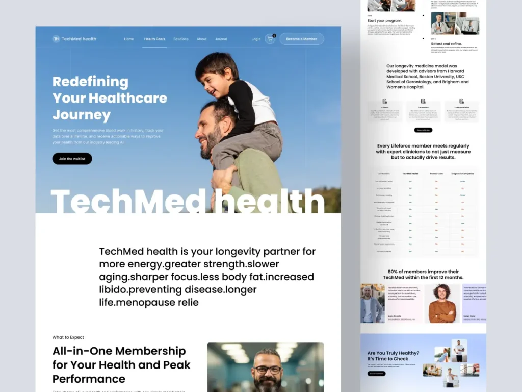
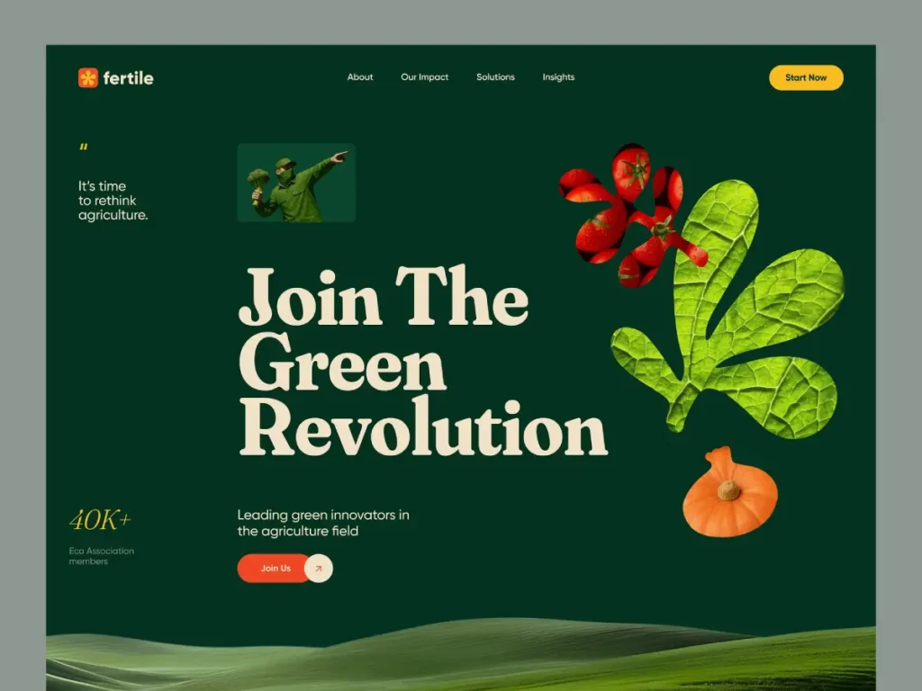
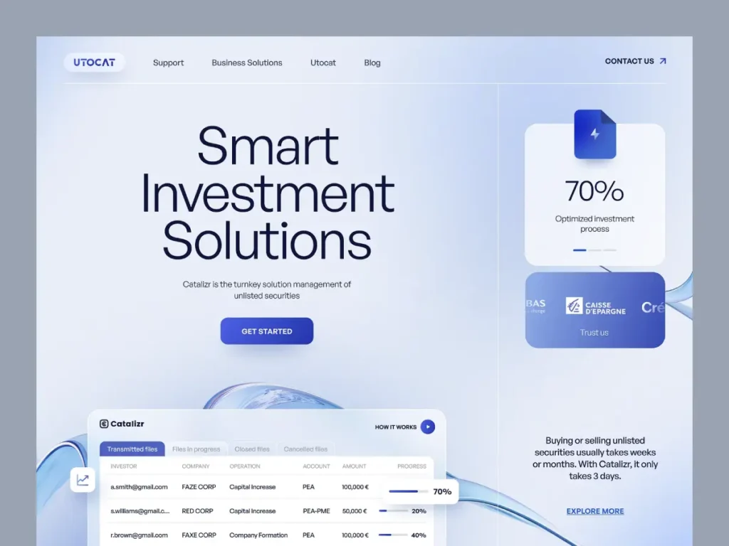
1. Grab Attention with a Strong Visual Hook
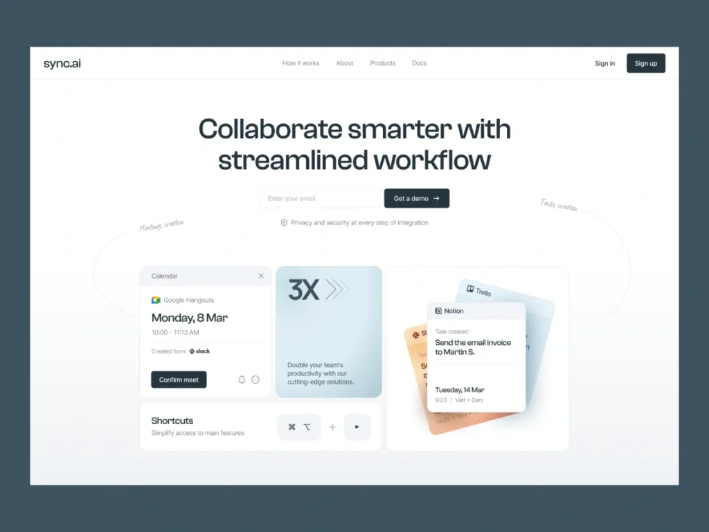
Why First Impressions Matter
Research shows that users take only 0.05 seconds to form an impression of your website. That means your hero section must deliver clarity and appeal instantly.
How to Do It in Elementor
- Use the Heading Widget with bold fonts.
- Pair it with a Text Editor Widget for a concise, supportive subheading.
- Use a compelling hero image or a muted background video.
Example
Headline: “Build a Website That Sells—Without Writing a Line of Code”
Subheadline: “Our done-for-you Elementor templates turn clicks into clients, fast.”
Remember: Clarity beats cleverness. Your visitors should immediately understand who you are and what you offer.
2. Define Your Primary Goal
Before dragging a single widget into place, ask yourself: What is the #1 action I want users to take?
Common Hero Goals:
- Encourage sign-ups (newsletter, free trial, consultation)
- Drive purchases (featured product or service)
- Book appointments or demos
- Navigate deeper into the site (scroll or view portfolio)
Having a single, focused goal helps shape your copy, layout, and design decisions.
Tip: Don’t try to sell everything at once. One goal = one CTA.
3. Write Benefit-Focused Copy
Your copy is the first “conversation” you have with a visitor. You only get one shot to communicate value, and it must happen fast.
Headline Best Practices:
- Keep it under 8–10 words
- Focus on benefits, not features
- Use emotional or result-driven language
Subheadline Tips:
- Expand on the headline’s promise
- Include a differentiator or support statement
- Aim for 1–2 short sentences
Elementor Implementation:
- Use Global Fonts and responsive text settings
- Use a max-width container to keep text readable across devices
4. Structure with Visual Hierarchy
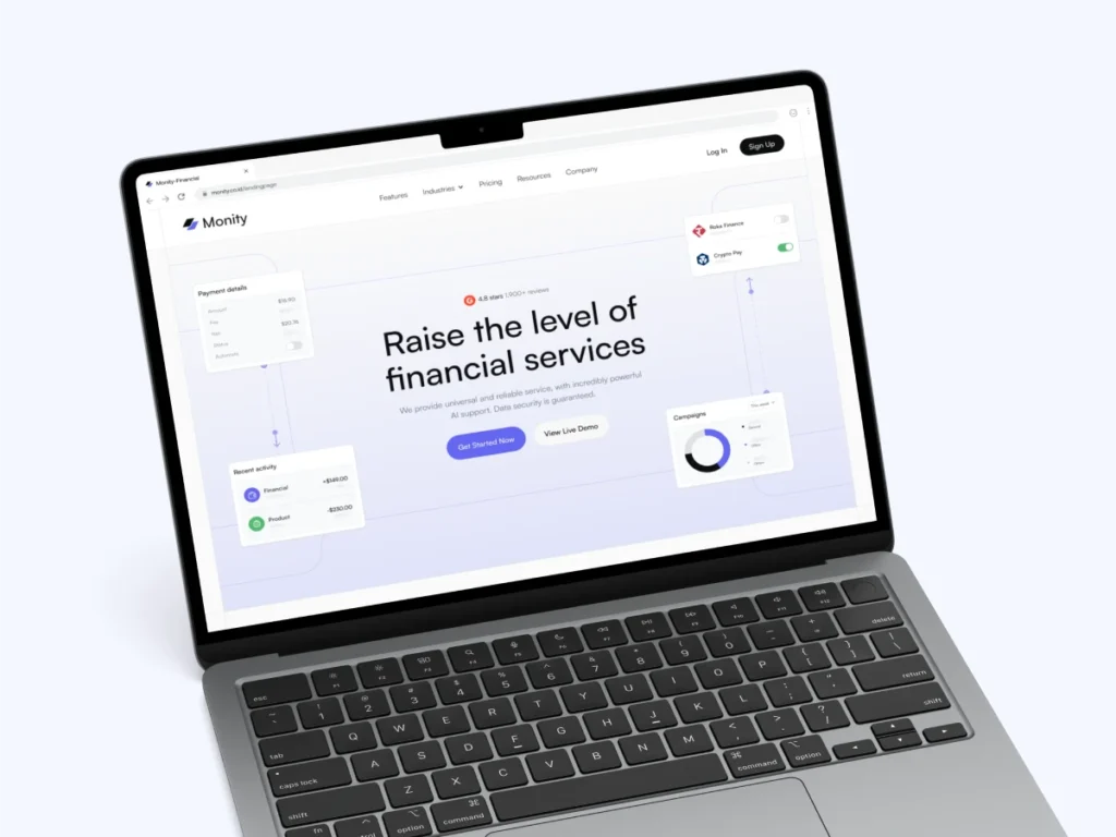
Elementor gives you layout flexibility with containers, columns, and inner sections. But it’s not about dragging widgets randomly—structure and visual hierarchy matter.
Layout Formula:
- Full-width section: Use this for your hero for maximum visibility.
- Two-column design: Place text on the left and an image or graphic on the right.
- Whitespace: Add padding and margins to create breathing room and prevent clutter.
Use the Container Widget (Flexbox) for advanced alignment and responsive control. Avoid overcomplicating with too many nested elements.
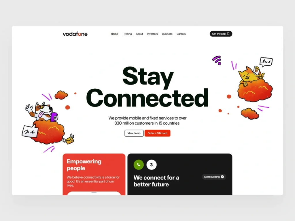
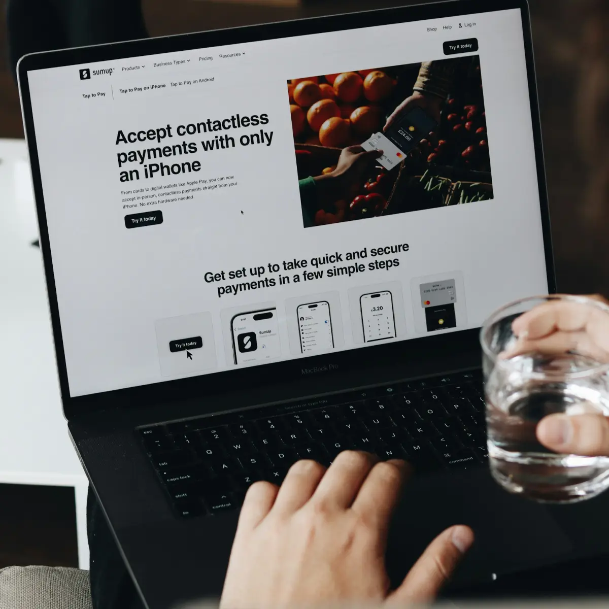
5. Choose the Right Hero Image or Video
Visuals tell your story before text does. The right image builds emotion and clarity. The wrong image distracts or confuses.
Hero Image Best Practices:
- Use real photos or high-quality mockups
- Focus on people using your product/service
- Ensure it relates directly to your offer
Background Video Tips:
- Use muted, looped, and subtle movement
- Keep video under 1MB or host via external CDN
- Use fallback images for mobile
Elementor Setup:
- Set your image or video as background via the Section settings
- Enable “Lazy Load” and ensure proper compression
6. Create a CTA That Drives Action
Your Call-To-Action is where the conversion happens. Don’t leave it as “Learn More.”
CTA Writing Tips:
- Use action verbs: Start, Get, Claim, Download
- Add a benefit: “Start My Free Trial” > “Submit”
- Keep it concise: 2–4 words usually work best
CTA Design in Elementor:
- Use the Button Widget
- Choose a color with high contrast from the background
- Set hover effects for interactivity
- Align it under your subheadline for maximum visibility
Example:
Button Text: “Claim My Free Template Kit”
Link: Lead magnet page or contact form
7. Add Trust Elements for Credibility
Before users click your CTA, they may need subtle reassurance. Integrating social proof or credibility indicators can increase trust and conversions.
Trust Elements You Can Add:
- Client logos (“Trusted by 500+ brands”)
- Star ratings or testimonials
- Security badges (SSL, payment protection)
- “Featured on” press logos
Elementor Widgets to Use:
- Image Carousel for logos
- Testimonial Widget for short reviews
- Icon List for trust points (e.g., “100% Money Back Guarantee”)
Place them below the CTA or to the side—visible but not overpowering.
8. Optimize for Mobile Devices
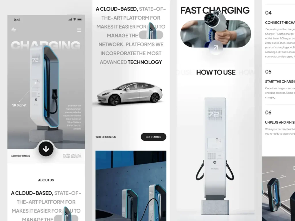
Over 60% of visitors are on mobile. Your hero section must work beautifully across all screen sizes.
Mobile Optimization Checklist:
- Use Elementor’s Responsive Mode (bottom left in editor)
- Adjust font sizes and spacing per device
- Stack columns: Usually text on top, image below
- Keep CTA buttons large enough to tap easily
Don’t rely only on desktop design—test on real phones and tablets too.
9. Maintain Speed and Performance
A slow hero section = lost conversions. Media-heavy layouts can drag your load time if not optimized properly.
How to Speed It Up:
- Compress images with TinyPNG, Smush, or ShortPixel
- Use lazy loading (enabled by default in recent WordPress versions)
- Minify CSS/JS via Autoptimize or WP Rocket
- Use CDNs like Cloudflare or BunnyCDN to deliver assets faster
Test Your Page:
Run a check via Google PageSpeed Insights or GTmetrix. Aim for scores above 90.
10. A/B Test to Improve Conversions
No hero section is perfect on the first try. Real success comes from testing and optimizing.
What to Test:
- Headlines (emotional vs. practical tone)
- CTA button copy and placement
- Hero image vs. no image
- Trust elements presence and positioning
Tools to Use:
- Elementor Pro’s A/B Testing (under Experiments)
- Google Optimize (free and powerful)
- Monitor results using Google Analytics or Microsoft Clarity
Run each variation for at least 1,000 visitors or two weeks to get valid insights.
Hero Section Optimization Checklist
Use this as your pre-launch checklist:
- Headline is clear, benefit-driven, and under 10 words
- Subheadline expands the promise in 1–2 lines
- CTA button uses action words and stands out
- Hero Image/Video: Compressed, clear, and relevant
- Trust indicators like logos or testimonials are present
- Layout is clean, responsive, and mobile-first
- Fast Loading: Lazy load, compress files, and use a CDN
- Variants are tested via A/B testing or experimentation tools
Final Thoughts
Designing a high-converting hero section in Elementor isn’t just about looks—it’s about clarity, strategy, and usability.
By focusing on a single goal, writing compelling copy, choosing the right visual layout, and optimizing for speed and mobile, you can build hero sections that actually drive results.
Keep testing. Keep improving. Your hero section is the gateway to higher conversions, more leads, and stronger brand impact.